
Top 5 Amazing Examples of Logo Design Ideas and Tips 2025
The Art of Logo Design
A logo is much more than a small graphic or a wordmark – it is the face of your business. top 5 amazing examples of logo design ideas & tips 2024. Think about some of the world’s most recognizable companies; the first thing that often comes to mind is their logo. Whether it’s the golden arches of McDonald’s or the swoosh of Nike, logos have the power to instantly convey a message, evoke an emotion, and stay in the memory of customers for years to come. In a world where consumers are bombarded with brands every day, a well-designed logo is essential to make your business stand out from the crowd.
The Importance of a Top Logo Design in Branding
A great logo is the cornerstone of effective branding. It sets the tone for how your brand is perceived, creating the first impression that lasts. A well-designed logo can help establish trust and credibility in your audience’s eyes, allowing them to form a positive connection with your brand. It also sets your business apart from competitors by showcasing your uniqueness. Whether you’re a startup or an established brand, having a logo that reflects your values and personality is key to connecting with your target audience. The right logo not only grabs attention but also serves as a consistent visual representation of your business across all platforms, ensuring that your brand message is always clear and recognizable.
Top 5 Logo Design Ideas & Tips to Inspire You
Curious about where to start with your logo design journey? In this blog, we’ll introduce you to the top 5 logo design ideas & Tips that are currently making waves in the design world:
- Minimalist logos that keep it simple but impactful.
- Retro and vintage logos for brands that love nostalgia.
- Bold typography-based logos that make a strong statement.
- Abstract logos that capture your brand’s essence with creativity.
- Hand-drawn logos that add a personal and authentic touch.
Stick around as we dive into each of these ideas in detail, helping you craft a logo that tells your brand’s unique story and leaves a lasting impression.
The Power of Minimalism: Why Simple Logos Are More Impactful Instead of Top Logo Design
Definition of Minimalism in Logo Design
Minimalism is a design philosophy centered around simplicity, clarity, and the elimination of unnecessary elements. In logo design, minimalism focuses on creating clean, easily recognizable visuals that convey the core essence of a brand without overcomplicating the message. A minimalist logo often features basic shapes, a limited color palette, and straightforward typography. By removing unnecessary details, minimalism allows a logo to be both powerful and versatile, ensuring that it resonates across different mediums and contexts.
Why Simple Logos Have More Impact
Simple logos are often the most memorable because they’re easy to recognize and recall. The human brain processes simple imagery faster, which means a minimalist logo makes a stronger, faster impact on the viewer. Brands like Apple and Nike understand the value of simplicity. The Apple logo is just an apple with a bite taken out, while Nike’s swoosh is a simple, dynamic checkmark-like symbol. Both of these logos communicate their brand’s identity effortlessly, relying on clean design rather than complexity.
A simple logo is also more versatile. It can be scaled up or down, used in black and white or color, and placed on a variety of backgrounds while still maintaining its integrity. This versatility ensures that your brand remains consistent, whether it’s on a billboard, website, or social media profile. In addition, a minimalist logo often appears more timeless, reducing the need for frequent redesigns and allowing your brand to build a consistent identity over time.
Examples of Famous Minimalist Logos
- Apple: The Apple logo is a great example of minimalism. The sleek, monochromatic design is iconic, instantly recognizable, and evokes a sense of innovation and simplicity, which aligns perfectly with the brand’s ethos.
- Nike: The Nike swoosh is another iconic minimalist logo. Its simple, dynamic shape symbolizes movement and speed, which ties into Nike’s focus on athletic performance. It’s clean and memorable, making it one of the most recognizable logos globally.
- McDonald’s: The “Golden Arches” of McDonald’s is a simple design of two arches forming the letter “M.” The logo’s simplicity makes it easily recognizable across the world, while the bright color adds to its visibility and impact.

In a market filled with an overwhelming number of logos and brand messages, minimalism is a way to ensure your brand stands out and remains etched in the minds of your audience. By focusing on the essentials, a minimalist logo helps communicate your brand’s values clearly and effectively, leaving a lasting impression without overwhelming the viewer. So, when it comes to top logo design, sometimes less really is more.
Typography-Focused Logos: The Art of Crafting Impactful Text-Based Brand Marks
Typography-focused logos, also known as wordmarks or logotypes, are a powerful design choice where the primary focus is on the typeface itself. These logos rely solely on the arrangement of text to convey the brand’s identity, giving businesses a distinctive, professional, and timeless appeal. Typography-focused logos can vary from being bold and modern to elegant and intricate, offering endless possibilities for brands looking to establish a unique identity through letterforms alone.
Why Typography-Focused Logos Work
Typography-focused logos are successful because they embody simplicity and clarity. By emphasizing the brand name, these logos make it easy for customers to remember and recognize the business. For brands that want to build strong name recognition, a typography-focused logo is a perfect choice because the logo itself becomes synonymous with the brand name. Think about companies like Google, Coca-Cola, or FedEx—each of these iconic brands relies on a typography-focused logo to ensure that their brand name remains top-of-mind.
The adaptability of typography-based logos is another reason they work well. These logos are versatile and can be easily adjusted for various mediums and scales. Whether it’s on a billboard, website header, or social media profile, typography-focused logos maintain their impact and legibility. Additionally, they can be seamlessly integrated into different branding materials without losing their identity, allowing for consistent branding across all platforms.
Elements of a Successful Typography-Focused Logo
- Typeface Selection: The most critical element of a typography-focused logo is the choice of typeface. A typeface can convey a wide range of emotions—from modern and sleek to playful and friendly. Choosing the right typeface is crucial for accurately representing your brand’s personality. For example, a luxury brand might choose a serif font that conveys sophistication, while a tech startup might opt for a sleek, sans-serif font that feels modern and innovative.
- Customization and Uniqueness: Typography-focused logos often involve customizations that make the brand name distinct. Adjustments like modifying individual letters, adding ligatures, or creating unique spacing can help set your logo apart from others. For example, the iconic Coca-Cola logo features a distinctive script font that has been custom-drawn to embody the brand’s heritage and timeless appeal.
- Color Palette: Color is an essential aspect of any logo, and in typography-focused designs, it helps add character and visual interest. The choice of colors can affect how the logo is perceived by the audience. A bold, bright color can make the logo stand out and convey energy, while a black-and-white logo can give a sense of professionalism and elegance.
- Spacing and Arrangement: Effective use of spacing ensures that the typography-focused logo remains readable and visually appealing at any size. The arrangement of letters, kerning (spacing between letters), and alignment are important factors that impact how a logo looks and feels. Thoughtful use of negative space can also enhance the overall design, adding visual interest while maintaining clarity.
Examples of Typography-Focused Logos
- Google: The Google logo is a great example of a typography-focused logo that has evolved over time while keeping its simplicity intact. Using a clean, sans-serif typeface, it communicates modernity, accessibility, and friendliness. The use of primary colors (red, blue, yellow, and green) adds a playful touch to the otherwise simple text-based logo.
- FedEx: The FedEx logo is a classic example of a well-designed typography-focused logo. The bold sans-serif typeface is professional and easy to read. What makes this logo particularly unique is the hidden arrow between the “E” and “x,” symbolizing precision and forward movement—a subtle but effective design element that adds depth to an otherwise simple logo.
- Coca-Cola: The Coca-Cola logo uses a cursive script font that has become synonymous with the brand’s heritage and sense of nostalgia. Its flowing, elegant lettering helps evoke the brand’s long history and its reputation as a classic, beloved beverage.
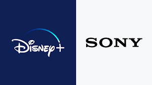
- Disney: The Disney logo, with its whimsical, custom typography, perfectly embodies the brand’s sense of magic and imagination. The distinctive style of the letters, especially the “D,” creates a visual identity that is instantly recognizable and full of personality, which aligns with Disney’s focus on storytelling and entertainment.
- Sony: Sony’s logo features a simple, bold serif typeface that conveys sophistication, reliability, and a sense of timelessness. It is a prime example of how straightforward typography can still create a powerful brand image.
Creating Your Own Typography-Focused Logo
When designing a typography-focused logo, it is crucial to start with a deep understanding of your brand’s values and personality. Consider the tone you want to communicate: Is it fun and playful, or serious and professional? The typeface should align with this tone. Whether you choose a pre-existing font or decide to create a custom one, the logo should be unique and convey a sense of authenticity.
Experiment with different styles, colors, and customizations to see what best represents your brand. Be mindful of readability, especially when scaling the logo to smaller sizes. Simplicity and legibility are key to ensuring that your typography-focused logo can be used across all types of branding materials, from business cards to digital advertisements.
Vintage and Retro Logos
Vintage and retro logos bring a sense of nostalgia and timeless charm, making them perfect for coffee shops, breweries, and boutiques. With their ability to evoke emotion, these logos connect businesses to their customers through a warm and familiar aesthetic. By using classic colors like sepia tones, muted greens, and warm oranges, vintage logos give a handcrafted, authentic feel that resonates well with patrons seeking unique experiences.
Line work and bold fonts are key trends in vintage logo design. Intricate line illustrations add a handcrafted appeal, while bold, serif fonts evoke the strength and reliability of bygone eras. These elements create a nostalgic branding experience that can make a business stand out in a crowded marketplace. Retro logo ideas often incorporate vintage icons like coffee cups, beer barrels, or sewing machines, enhancing their relevance to specific industries.
Whether you’re looking for a cozy design for a coffee shop, a rugged look for a brewery, or an elegant style for a boutique, vintage and retro logos are ideal for capturing a sense of history and quality. Explore nostalgic branding to add a classic touch that customers will recognize and love.
Abstract and Geometric Logos
Abstract and geometric logos are powerful tools for creating memorable brand identities. By using unique shapes, these logos convey meaning without relying on words, allowing for an instant connection with the audience. Abstract designs help brands communicate complex ideas in a simple, visually compelling way, making them an ideal choice for companies seeking a distinctive and versatile identity.
Geometric elements play a significant role in these logos. Incorporating lines, circles, and symmetry adds visual harmony, consistency, and professionalism. Circles represent unity and completeness, while lines suggest direction and movement. Symmetry creates balance, making the design pleasing to the eye.
Examples of abstract logos include Spotify and Adidas, both of which use geometric forms effectively. Spotify’s logo features three curved lines that represent sound waves, instantly pointing to its core purpose—music streaming. Adidas uses three stripes forming an abstract mountain, symbolizing challenges and progress. Both brands illustrate how abstraction can create a logo that is not only unique but also highly memorable.
If you’re looking for inspiration for your brand, consider exploring abstract logo ideas and incorporating geometric elements to create a modern, impactful design.
Responsive and Dynamic Logos
Responsive and dynamic logos are designed to adapt seamlessly to different screen sizes and platforms, making them crucial in today’s digital landscape. These logos maintain brand recognition while adjusting their form, size, and complexity to fit various devices, such as smartphones, tablets, and desktops, ensuring they always look their best, whether on a website, app, or social media profile.
In the digital age, where users interact with brands across multiple touchpoints, responsive logo design is essential. It enhances user experience by providing a cohesive brand presence, regardless of the medium. Adaptive logo ideas may involve simplifying elements for smaller screens while retaining key brand features, ensuring that the logo remains recognizable and impactful.
Google is a prime example of dynamic branding. Its logo adapts beautifully across different screen sizes, and its playful variations for special events—known as “Google Doodles”—highlight its flexibility and creativity. This approach keeps the brand engaging and relevant to its audience.
Incorporating responsive logo design into your branding strategy ensures your logo remains visually effective, strengthens brand consistency, and creates a positive impression across all digital platforms.
Conclusion
Each type of logo—whether minimalist, typography-focused, vintage and retro, abstract and geometric, or responsive and dynamic—offers unique benefits that help convey a brand’s identity effectively. Minimalist logos stand out with their simplicity and clarity, while typography-focused logos use fonts to create a distinct personality. Vintage and retro logos evoke nostalgia and authenticity, making them perfect for businesses seeking a classic touch. Abstract and geometric logos convey complex ideas through shapes, creating versatile and memorable identities. Finally, responsive and dynamic logos ensure a consistent and adaptive presence across digital platforms. By choosing the right style, brands can communicate their values and connect with their audience in meaningful ways.
External and Internal Links
- Varsha Kohli LinkedIn Profile
- Visit DigiAdgency
- Hire a Digital Marketing Freelancer
- Best Digital Marketing Agency
About the Author
Varsha Kohli is a digital marketer and graphic designer with expertise in Digital Marketing, Canva, and SEO blogging. She also designs thumbnails, labels, brochures, and video ads. Explore more of her work on DigiAdgency.